Python Matplotlib, a Helpful Tutorial

In this Python Matplotlib tutorial series, you will learn how to create and improve a plot in Python using pyplot. Matplotlib is a 2D plotting library written for Python. It consists of pyplot (in the code often shortened by “plt”), which is an object oriented interface to the plotting library. Matplotlib is an initiative of John Hunter, Darren Dale, Eric Firing, Michael Droettboom and the Matplotlib development team. Lets stop talking and start creating some beautiful plots using Matplotlib!
Data Visualization
In this post, we will gradually build a data visualization of two simple functions: sine and cosine. First, the main concepts are explained and then the step-by-step tutorial is explained.
Figures & Axes & Axis
The figure can be seen as the canvas, on which all drawing components are plotted. The figure consists of axes, which are subdivisions of the figure. Each of the axes consists of one or more axis (horizontal (x-axis), vertical (y-axis) or even depth (z-axis)). All of this is visualized in the following picture:
First simple plots
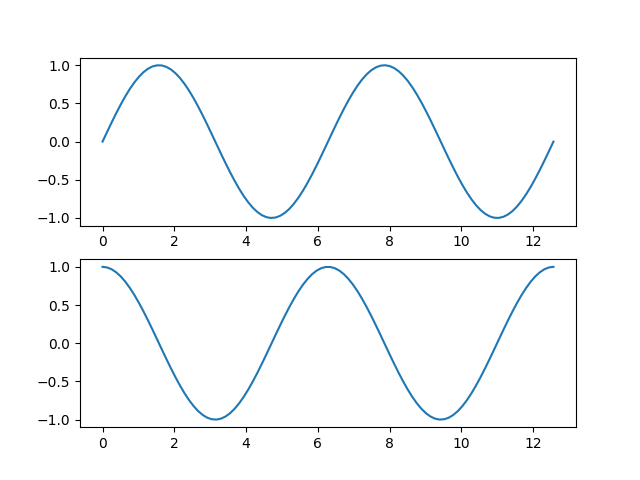
We will now create two very, very simple plots. One containing
$$y_1=\sin(x_1)$$
(sine) and the other one containing
$$y_2=\sin(x_2)$$
(cosine). For the calculations, we use NumPy (shortened by “np”). Matplotlib is often used in combination with Numpy. The code should be self-explaining (if not, please mention it in a comment).
import numpy as np
import matplotlib.pyplot as plt

# Create the figure and two axes (two rows, one column)
fig, (ax1, ax2) = plt.subplots(2, 1)

# Create a plot of y = sin(x) on the first row
x1 = np.linspace(0, 4 * np.pi, 100)
y1 = np.sin(x1)
ax1.plot(x1, y1)

# Create a plot of y = cos(x) on the second row
x2 = np.linspace(0, 4 * np.pi, 100)
y2 = np.cos(x2)
ax2.plot(x2, y2)

# Save the figure
plt.savefig('sin_cos.png')
This results into the following:
Combine axes into one plot
It is also possible to combine the current axes into one plot by using the following code:
import numpy as np
import matplotlib.pyplot as plt

# Create the figure and two axes (two rows, one column)
fig, ax1 = plt.subplots(1, 1)

# Share the x-axis for both the axes (ax1, ax2)
ax2 = ax1.twinx()

# Create a plot of y = sin(x) on the first row
x1 = np.linspace(0, 4 * np.pi, 100)
y1 = np.sin(x1)
ax1.plot(x1, y1)

# Create a plot of y = cos(x) on the second row
x2 = np.linspace(0, 4 * np.pi, 100)
y2 = np.cos(x2)
ax2.plot(x2, y2)

# Save the figure
plt.savefig('sin_cos_2.png')
This results into the following data visualization of both functions:
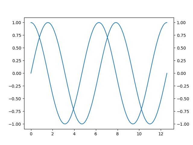
However, notice that this plot is quite simple. It is not even clear which line belongs to what function. In the next few sections, we will add gradual improvements to the plot.
Add a Legend
The first improvement is to add a legend. With the legend, it becomes clear what line belongs to what function (either sine or cosine).
import numpy as np
import matplotlib.pyplot as plt

# Create the figure and two axes (two rows, one column)
fig, ax1 = plt.subplots(1, 1)

# Share the x-axis for both the axes (ax1, ax2)
ax2 = ax1.twinx()

# Create a plot of y = sin(x) on the first row
x1 = np.linspace(0, 4 * np.pi, 100)
y1 = np.sin(x1)
# Add a label for the legend
function1 = ax1.plot(x1, y1, label='Sine')

# Create a plot of y = cos(x) on the second row
x2 = np.linspace(0, 4 * np.pi, 100)
y2 = np.cos(x2)
# Add a label for the legend
function2 = ax2.plot(x2, y2, label='Cosine')

# Create the legend by first fetching the labels from the functions
functions = function1 + function2
labels = [f.get_label() for f in functions]
plt.legend(functions, labels, loc=0)

# Save the figure
plt.savefig('sin_cos_3.png')
This results into the following:
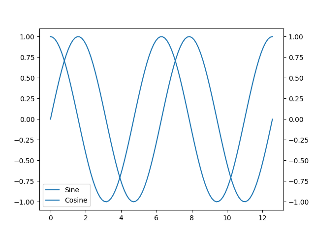
Notice the loc=0 parameter. This sets the location of the legend. loc=0 automatically selects the best place for the legend. There is one clear downside of our current figure now. All the functions have the same color. The next improvement adds color to the plot.
Adding some color
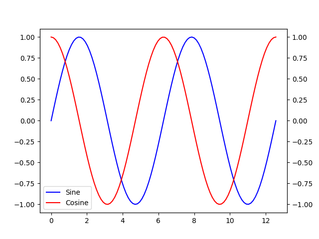
Adding color is one of the easiest steps! This results into the following code changes:
import numpy as np
import matplotlib.pyplot as plt

# Create the figure and two axes (two rows, one column)
fig, ax1 = plt.subplots(1, 1)

# Share the x-axis for both the axes (ax1, ax2)
ax2 = ax1.twinx()

# Create a plot of y = sin(x) on the first row
x1 = np.linspace(0, 4 * np.pi, 100)
y1 = np.sin(x1)
# Add a label for the legend and make it blue
function1 = ax1.plot(x1, y1, 'b', label='Sine')

# Create a plot of y = cos(x) on the second row
x2 = np.linspace(0, 4 * np.pi, 100)
y2 = np.cos(x2)
# Add a label for the legend and make it red
function2 = ax2.plot(x2, y2, 'r', label='Cosine')

# Create the legend by first fetching the labels from the functions
functions = function1 + function2
labels = [f.get_label() for f in functions]
plt.legend(functions, labels, loc=0)

# Save the figure
plt.savefig('sin_cos_4.png')
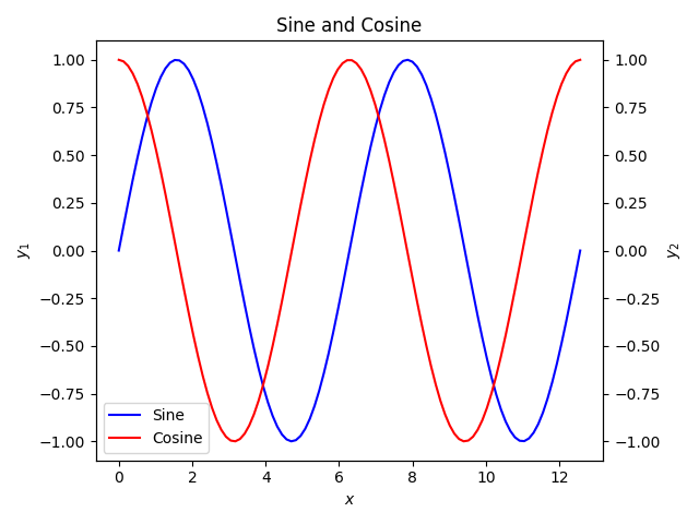
We now get the following plot:
Adding Title and Axis labels
Now we will add the title to our plot and add the axis labels by using the following code changes:
import numpy as np
import matplotlib.pyplot as plt

# Create the figure and two axes (two rows, one column)
fig, ax1 = plt.subplots(1, 1)

# Share the x-axis for both the axes (ax1, ax2)
ax2 = ax1.twinx()

# Create a plot of y = sin(x) on the first row
x1 = np.linspace(0, 4 * np.pi, 100)
y1 = np.sin(x1)
# Add a label for the legend and make it blue
function1 = ax1.plot(x1, y1, 'b', label='Sine')

# Create a plot of y = cos(x) on the second row
x2 = np.linspace(0, 4 * np.pi, 100)
y2 = np.cos(x2)
# Add a label for the legend and make it red
function2 = ax2.plot(x2, y2, 'r', label='Cosine')

# Create the legend by first fetching the labels from the functions
functions = function1 + function2
labels = [f.get_label() for f in functions]
plt.legend(functions, labels, loc=0)

# Add x-label (only one, since it is shared) and the y-labels
ax1.set_xlabel('$x$')
ax1.set_ylabel('$y_1$')
ax2.set_ylabel('$y_2$')

# Add the title
plt.title('Sine and Cosine')

# Adjust the figure such that all rendering components fit inside the figure
plt.tight_layout()

# Save the figure
plt.savefig('sin_cos_5.png')
This results into the following plot:

This already is a great plot. In the last step, we will use a different rendering engine (build on top of Matplotlib) so all our code is reused but our plot gets improved!
Using a different Rendering Style
We will now use the seaborn library to improve the style of the plot. For this, we will use the following code:
import numpy as np
import matplotlib.pyplot as plt
# Import another rendering engine
import seaborn as sns

# Create the figure and two axes (two rows, one column)
fig, ax1 = plt.subplots(1, 1)

# Share the x-axis for both the axes (ax1, ax2)
ax2 = ax1.twinx()

# Create a plot of y = sin(x) on the first row
x1 = np.linspace(0, 4 * np.pi, 100)
y1 = np.sin(x1)
# Add a label for the legend and make it blue
function1 = ax1.plot(x1, y1, 'b', label='Sine')

# Create a plot of y = cos(x) on the second row
x2 = np.linspace(0, 4 * np.pi, 100)
y2 = np.cos(x2)
# Add a label for the legend and make it red
function2 = ax2.plot(x2, y2, 'r', label='Cosine')

# Create the legend by first fetching the labels from the functions
functions = function1 + function2
labels = [f.get_label() for f in functions]
plt.legend(functions, labels, loc=0)

# Add x-label (only one, since it is shared) and the y-labels
ax1.set_xlabel('$x$')
ax1.set_ylabel('$y_1$')
ax2.set_ylabel('$y_2$')

# Add the title
plt.title('Sine and Cosine')

# Adjust the figure such that all rendering components fit inside the figure
plt.tight_layout()

# Save the figure
plt.savefig('sin_cos_6.png')
This results into our final plot:

Some Excellent Videos
In this section, I will highlight some videos I found excellent for learning the concepts of pyplot.
The following video series introduce the basic concepts:
The next few videos are on advanced topics:
Conclusion (TL;DR)
It is quite easy to create plots using Matplotlib. This tutorial shows the steps to build a plot gradually. If you have any questions, please let me know in the comments.
